Experience
impressions of beauty hidden in the normal
Studio and en plein air painter of oil and watercolors. Discover art work inspired by American’s Dairyland and Great lakes region.
Located on the shores of Lake Michigan in Cleveland Wisconsin
Paint with rob
In the studio or out in the community. Explore the places I like to paint or inquire about open studio opportunities
studio Lessons
Watercolor, traditional oils with a grisaille under-painting or alla prima oils.
From the blog
Stay up to date with the latest from Rob’s blog.
-
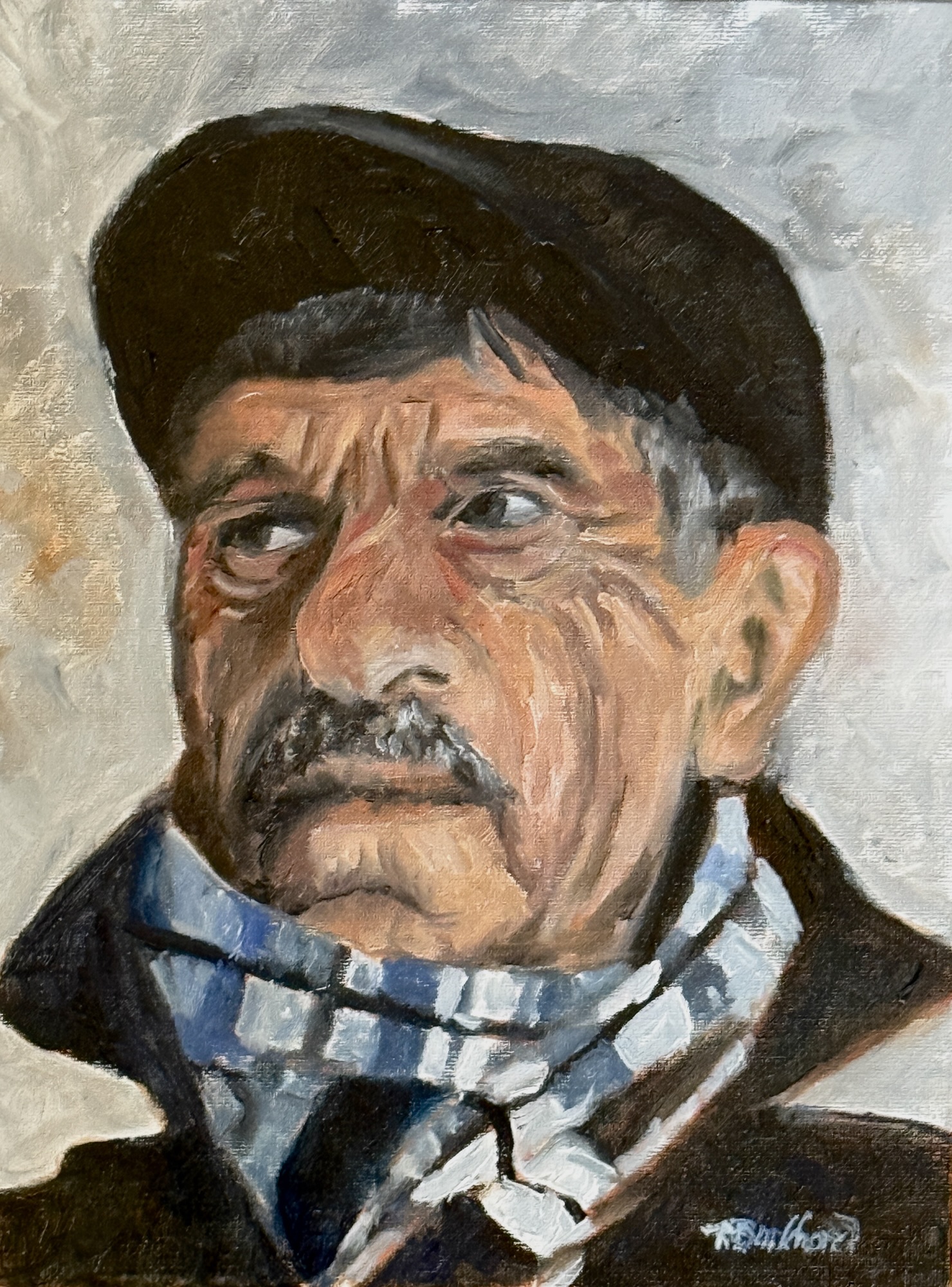
Next Portrait on way to 50
A quick study of a Mediterranean looking man.
-

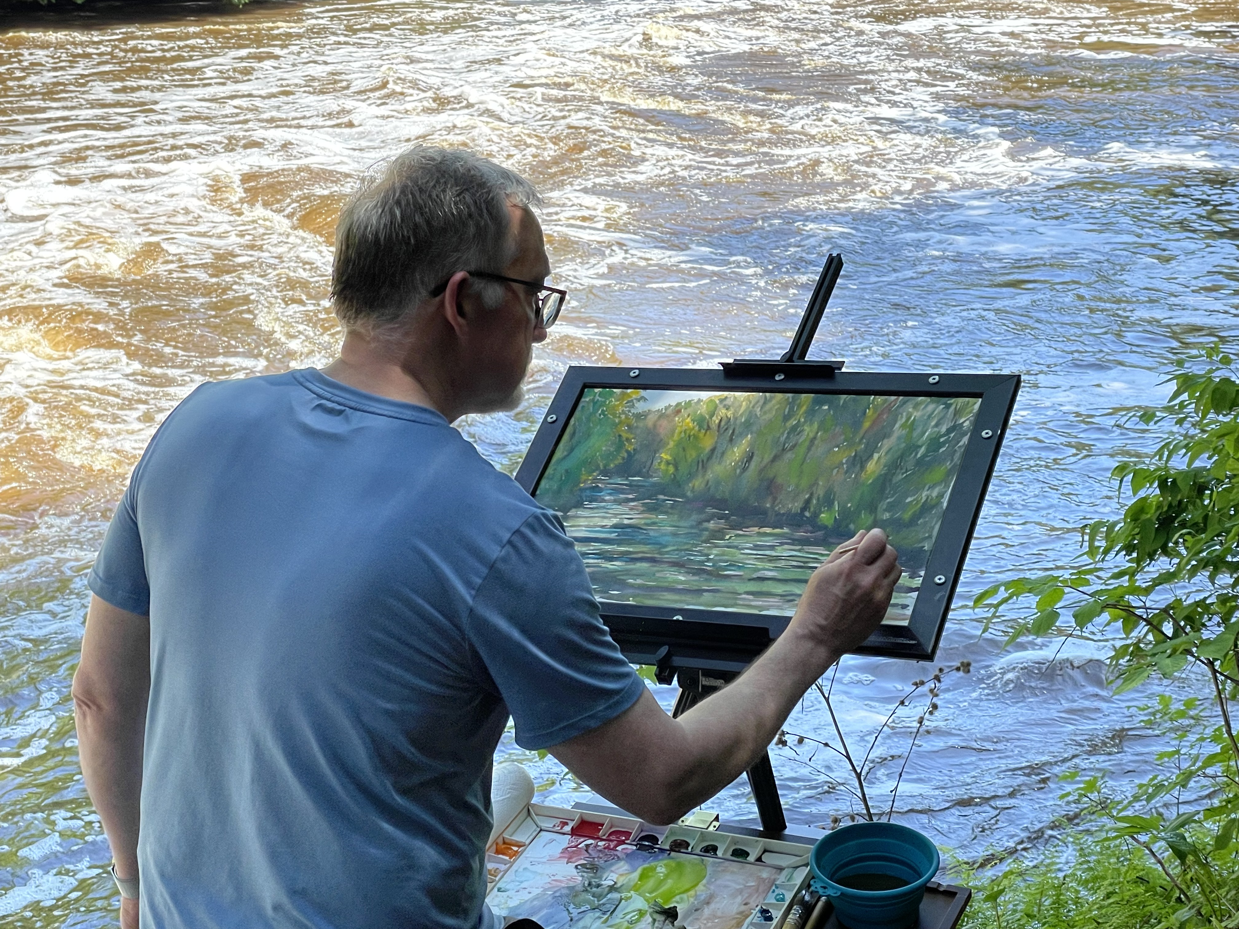
Cedarburg Plain Air painting competition – the final four!
These are my four entries after 5 days of painting. Looking forward to see what the judges think, but regardless it was a blast to…
-
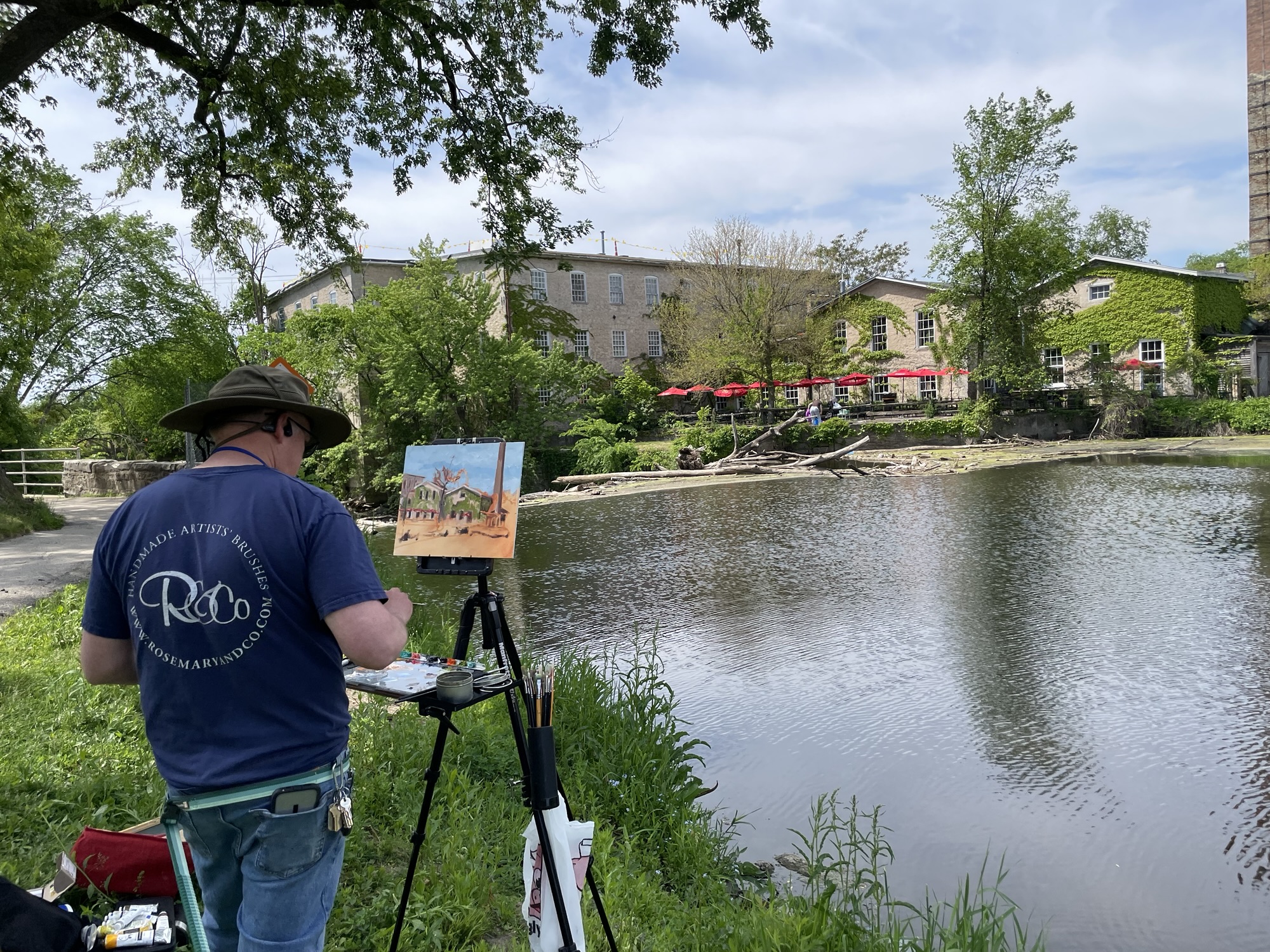
Cedarburg Plein Air competition day two in the bag
Got a great painting in Cedar Creek and sold yesterday’s painting. Who can argue with that!
-
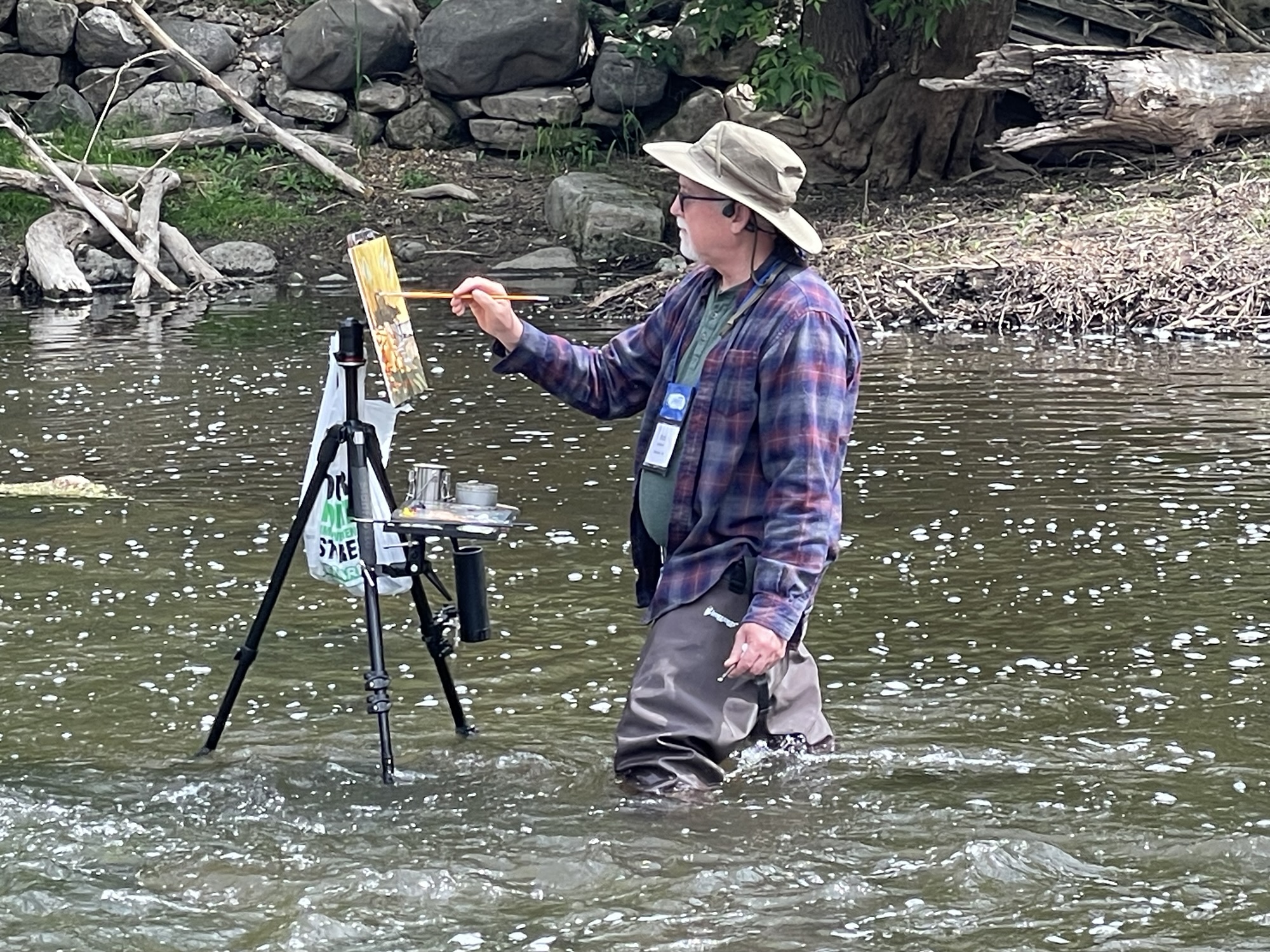
Cedarburg Plein Air competition day one in the bag.
I got a good painting today for the Fresh From Cedarburg sale tomorrow. Will try to get another wading in Cedar Creek in the morning.